In my latest project, I contributed to the 4th edition of Kantar's Finding the Future series, which aimed to uncover emerging trends in food and beverages and provide insights for brands seeking to identify future innovation, growth, and activation opportunities. I created custom imagery, data graphics, and diagrams and laid out the 63-page report. I also contributed to the report’s content strategy and copy flow. Other assets included an offer brochure and PowerPoint template, landing page graphics, and animated social media posts for our digital platforms. Overall, my work helped showcase the latest trends driving consumer behavior and equip brands with the tools they need to stay ahead in a rapidly-evolving market.
I led the creative direction for KAiA, Kantar’s AI-powered assistant — developing the brand identity, launch visuals, social campaign, and the overall visual language for the experience.
At the center of the system is the KAiA orb, a flexible graphic device that represents AI’s ability to evolve and adapt. It became the anchor across motion, color, and form, creating a cohesive visual system across marketing and product touchpoints.
My focus was on shaping how KAiA shows up visually, ensuring the technology feels intelligent, clear, and human — while the product team led the platform development itself.
This landing page was created to promote Cardinal Health's Dressing Change Organizer, a system that prevents the spread of Central Line-Associated Bloodstream Infections (CLABSIs). This type of infection occurs when bacteria enter the bloodstream through a central line, a severe concern for patients in healthcare settings.
The landing page was designed to be an informative and user-friendly resource for medical professionals. It includes a calculator to help them estimate potential cost savings from the Dressing Change Organizer and provides step-by-step instructions on how to use the system effectively. The page also illustrates how patients get infected and lists CDC-recommended prevention tips to help medical professionals understand the importance of this system.
The look and feel of the landing page were created to align with Cardinal Health's brand guidelines. I sourced branded iconography and photography to create a cohesive visual experience. The page is designed as a continuous scroll with animated icons, carousels, toggles, and CTAs. It was developed with a mobile-first approach—I collaborated with the UX team to build wireframes for desktop and mobile. The landing page is a helpful resource for medical professionals to learn more about the Dressing Change Organizer and how it can help prevent CLABSIs.
Kantar's iLab launched its first yearly external innovation challenge. The challenge aims to bring together the brightest minds worldwide to help consumer brands make more sustainable products, advertising, and business decisions. Through this initiative, iLab hopes to drive innovation and create a positive impact on consumers.
As part of the challenge, a custom look and feel was developed to promote the initiative. A suite of assets has been created, such as a custom landing page, promotional video, wordmark/logo, social media cards, interactive media kit, one-pagers, email banner, and an email signature banner, to communicate the sustainability message to the target audience effectively.
The challenge offers a unique opportunity for individuals and organizations to showcase their ideas and contribute to a more sustainable future. Participating in this challenge will allow participants to connect with industry experts and gain exposure to their innovative solutions. iLab is looking for the most forward-thinking and impactful ideas to drive real change in the consumer goods industry.
The website was custom designed for Gene Andrew Jarrett, an award-winning author, and scholar. The design process included competitive analysis research, user experience research, and information architecture, which were used to inform the development of low and high-fidelity wireframes.
These wireframes were then used as the basis for the final layout and design of the website, which was implemented using a content management system. The website presents Gene Andrew Jarrett's work, writings, and professional background, focusing on usability and user experience to make it easy for the audience to navigate and find the relevant information they need. The website design and development aimed to showcase the work and accomplishments of the author, making the best impression and efficiently reaching the potential audience.
Breakthrough 2020: A Whole New Energy is an annual three-day event hosted by Kantar. The event brings together leaders from leading media and creative agencies to address insights and trends within AI and technology. It features companies such as TikTok, Snapchat, Google, The New York Times, Facebook, and other well-known industry players.
I created a bespoke event logo and device by customizing Kantar's branded typeface, turning the "A" within Breakthrough into an arrow, and adding a radiant, glowing effect. The thought was that the arrow (device) could be modified yearly, depending on the event's theme. This year the bright arrow was chosen as the event's device because it represents technology, innovation, and forward-thinking.
The event materials created include the following: logo animation, directional signage, t-shirts, mobile app user interface, standing banners, slide deck presentations, speaker and panelist gift bags, email template, social media graphics, and stage design which all follow the theme and the design language of the event. The materials aim to create a consistent, cohesive, and engaging event experience that aligns with the theme and purpose of the event.
The booklet, designed for the 2019 X4 Summit, aims to showcase critical findings and insights from Kantar's customer experience study. The study focuses on how brands can be more consumer-focused and how this approach can lead to better business outcomes. The booklet is 16 pages long and follows Kantar's brand guidelines, utilizing the brand's design elements and visual style.
The layout includes a series of custom double-exposure images created to highlight the theme of consumer focus and a set of custom data graphics to make the findings more accessible and easy to understand. The booklet is created with the purpose of providing guidance and best practices for brands that aim to improve their customer experience and be more consumer-focused.
A diverse portfolio of logo designs tailored to meet the unique needs of various clients. From sleek and professional designs for corporate market research firms to vibrant and dynamic logos for training facilities and startups, each design is crafted to communicate the brand's message and values effectively. You'll also find examples of logo designs created for non-profit organizations, highlighting a range of styles and approaches.
Created in the wake of the Covid-19 pandemic. These digital one-pagers give marketers an essential insight into American consumers and how they navigate brands during these unpresidential times. Topics include but are not limited to travel, economic struggle, how brands see gender, and social justice. I collaborated with both marketing and senior leaders to create digital interactive templates, website pages, custom data graphics, and social media posts.
"Marketing in Motion" is the fifth installment of "Getting Media Right Report," a comprehensive annual thought leadership study that delves into the objectives, opportunities, and challenges marketers face in the ever-evolving media and digital landscape. The design was a literal play on the theme, invoking motion and movement to do that. I designed and laid out this 24-page booklet to be consistent with our brand. The booklet was distributed globally to clients like Twitter, Facebook, Google, etc.
I used acrylic and oil paint to coat transparent plastic paper to achieve the custom paint graphics. Each piece was then photographed and further manipulated using Photoshop. In addition to the booklet, I also designed accompanying materials such as email templates, social media posts, and a landing page on Kantar's website to direct clients to the study.
"Google's Go-to-Market Strategy" was a project developed specifically for our internal Google team to have a single look and feel when pitching client work to Google. As the lead designer on the project, I was responsible for creating all of the Google-branded illustrations. My team and I also collaborated to structure and organize the content, resulting in a 260-slide template gallery that included designed layouts, high-quality photography, and project-specific imagery. The template gallery was an integral part of the overall Go-to-market strategy and effectively communicated the approach to stakeholders across the organization.
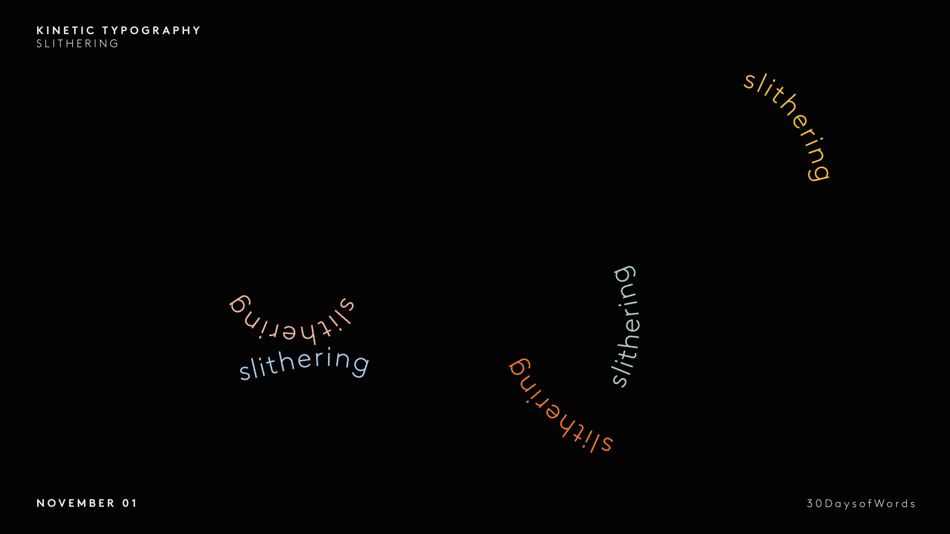
This personal creative project delves into the use of animation and motion graphics to create dynamic and engaging kinetic typography. By using typography as a critical element and incorporating motion, this project explores the potential of animation and motion graphics to bring the text to life and create dynamic and expressive visual compositions.
The "NYU Imagine Campaign" project was developed to showcase the benefits of a new, state-of-the-art high-rise facility for students and faculty at New York University. The campaign aimed to inform and educate the community about the potential positive impact of this technology-driven building on the surrounding area.
As the lead designer for the project, I created a comprehensive visual campaign that included five poster series, a custom font treatment, and social share graphics. The design concept was centered around motion and change, with blur on the letterforms to reflect this theme. Bold colors and strategic use of negative space were used to capture the viewer's attention and spark their imagination. The short phrases used in the campaign were carefully chosen to inspire thoughts about how this new facility could look and function. Overall, the campaign effectively communicated this new facility's potential to the NYU community.
"Painted Typography" is an ongoing exploration of the structure and rhythm of letterforms through the medium of actual paint. The process begins by hand painting the letters, then photographing the results. Afterward, the photographs are manipulated in Photoshop to study further and accentuate each letterform's unique qualities. This project is a means of examining the technical aspects of typography and allows for the discovery of new forms and visual language by blending traditional and digital mediums.
The "OnePlus and Arc'teryx Alliance" campaign was a product collaboration between the smartphone company OnePlus and the technical outerwear brand Arc'teryx. The campaign aimed to promote a new phone designed for travelers and adventurers. The phone was developed to not only look good but also to stand up to all the elements. The Alliance combined powerful technology with durability to create a product with strength, timeless quality, and original design.
As the lead designer for this campaign, I was responsible for creating a cohesive visual identity that effectively communicated the features and benefits of this new product. The designs included a product render, a landing page, social media posts, social media ads, billboard ads, and home activation. The visuals were all designed to showcase the technology and durability that makes this phone stand out for travelers and adventurers. Overall, the campaign successfully conveyed the unique value proposition of this product collaboration and helped boost sales.
"The Mendelssohn Electric" is a new children's play produced by The Trusty Sidekick Theater Company. A 1980's romantic comedy musical, the play tells the story of a young inventor who creates a robot that can think, feel and love. To promote the play, I was tasked to create a visual identity that captures the playful and energetic spirit of the production.
I designed a custom logo, poster, and website for the project. The design concept was inspired by the 80's Synth-pop aesthetic, focusing on bright and vibrant colors, bold gradients, neon, and shapes. These design elements were intended to evoke the nostalgia and fun energy of the 80s while providing a fun and playful backdrop to the performance. All elements were harmoniously integrated to offer a unique and cohesive visual representation of the show. Overall, the campaign effectively captured the tone and atmosphere of the play, drawing in audiences and helping the company with a successful run.
Photography: By Stephanie Galarza
In 2017, my team and I developed and executed a comprehensive marketing campaign to launch Kantar's BrandZ US Top Most Valuable Brands of 2018, the first edition of the company's US-specific brand equity ranking book. I was responsible for designing various elements of the campaign, including a custom typeface treatment, graphics, and a series of canvas paintings used in the campaign. Additionally, I created the book cover, program, and name badges for the launch event and contributed to video animation production. The campaign and event aimed to promote the book launch and a panel discussion on brand equity and value.
"The Insights Journey: Connecting to Consumers in 2016" was a project aimed to highlight the top ten insights that GfK had identified for that year. The result was a poster featuring custom illustrations that effectively communicated vital insights and data, accompanied by QR codes linked to supporting documents. This project was produced in a limited run of 200 posters and distributed internally to GfK staff and externally to clients to share insights and information with a broader audience engagingly and interactively.
Breakthrough 2019 was an annual three-day event hosted by Kantar, which brought together senior leaders from various industries, including marketers, tech agencies, and media companies. The event aimed to provide a transformative experience and result in actionable insights and new connections for attendees. This year the event was held in Hollywood, California, with the theme of "escape the ordinary" to inspire attendees to think differently.
The challenge was to craft a distinctive and captivating wordmark that would effectively brand the event. We were asked to include specific elements in the design, such as a nod to the concept of "escape" and the fact that this was the initiative's third anniversary. As the lead designer, I created the event's visual identity and overall aesthetic. I utilized a slash in the center of the letter "B" to symbolize the direct path to insights and novel perspectives. Creating the cut between the 'B' created an illusion of a letter "E," which represents "escape," and the number "3" to signify the three years of the initiative.
Other collateral materials included t-shirts, stage designs, social media graphics, email templates, digital presentation slides, notebooks, pens, and booklets. The designs aimed to create an immersive experience, help attendees connect with the event's theme, and generate new ideas and inspirations.
This project was a marketing campaign developed for the 2018 Cannes Conference in Cannes, France. The campaign aimed to promote a panel discussion led by Kantar BrandZ, featuring some of the industry's top brands and focusing on the theme of "the bottom line." The creative team was tasked with creating a visual narrative that would communicate this idea in an impactful and engaging way.
The campaign's collateral included a promotional poster, presentation deck, and social media graphics. The designs were created to reflect the theme of disruptive creativity, embodied by brands like Uber and Starbucks, who challenge traditional conventions and create new ways of doing things. The images used in the campaign were custom-made and featured a pattern of placing a modern, disruptive element within a traditional context. For example, the image of a watch featured a conventional watch face with a stylish watch face placed within it, representing the disruption of standard conventions. The campaign's goal was to create a visual narrative that would communicate the idea of disruptive creativity and how it relates to the bottom line, engaging the audience and facilitating the understanding of the panel discussion.
This project was the inaugural issue of Getting Media Right. This thought leadership piece focused on marketers' aspirations, challenges, and opportunities in the constantly evolving media and digital landscape. The goal of the project was to create a simple, clean, and visually stimulating design that effectively communicated the report's key insights and data while also humanizing the information to make it more relatable to readers.
As the lead designer, I was responsible for creating the data graphics and designing the layout of the 36-page booklet. I worked closely with the marketing team to ensure that the design adhered to Kantar Millwardbrown's brand guidelines while incorporating complementary imagery and iconography to make the report more engaging and visually appealing. The project's goal was to create an effective thought leadership piece that would be valuable for readers and communicate the information in a clear, organized, and visually attractive way.
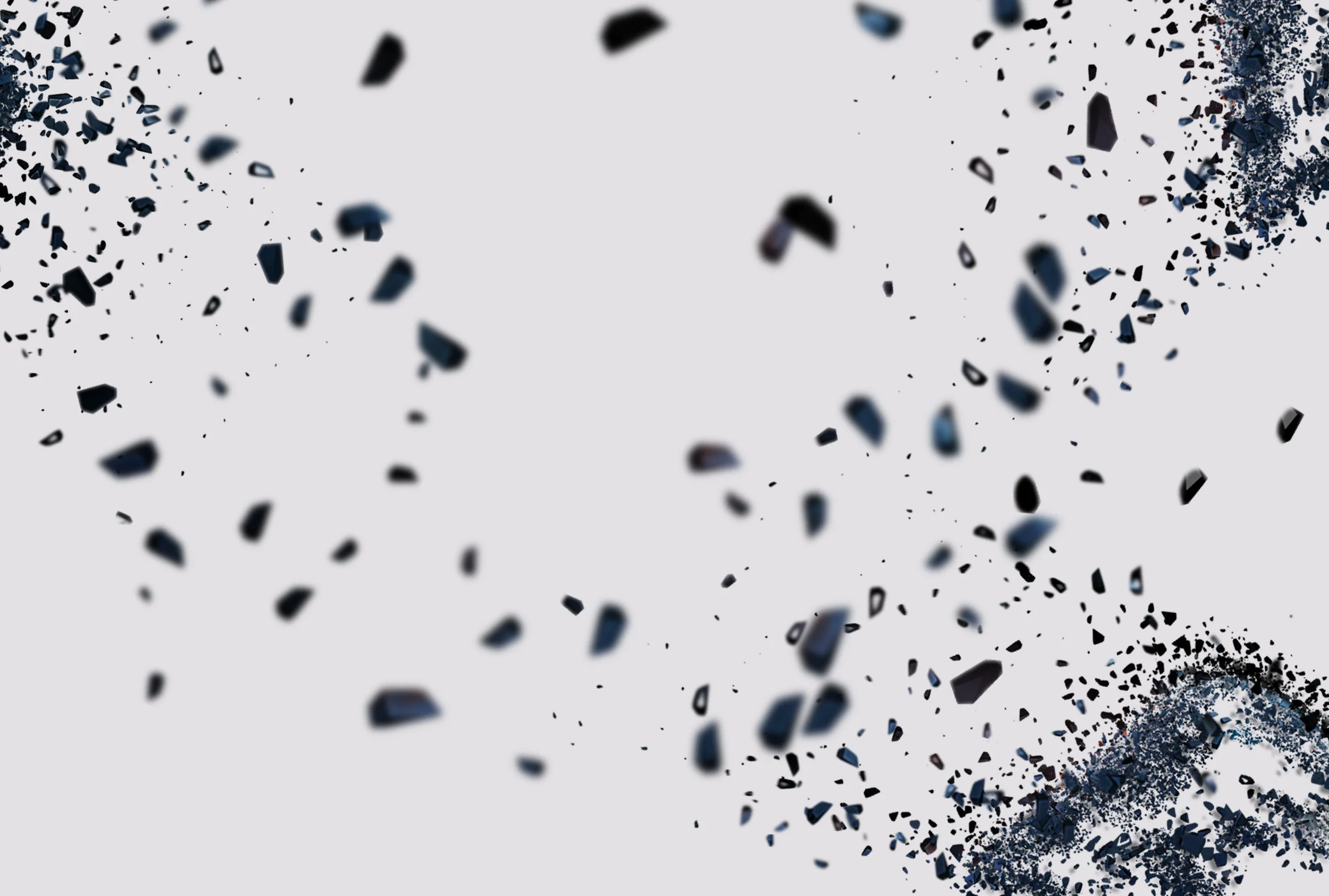
For Breakthrough 2017: Breaking Through Barriers, I created a custom event logo. The word “break” illustrates continuous motion, while the name “through” is set in bold to invoke stability and reliability, like the way our event creates new experiences. I also developed a fragment-burst graphic to help tie back to the theme. Other marketing collateral included the creation of stage graphics, imagery, one-pagers, and volunteer t-shirts.